ECHELON CYCLES | DESKTOP REDESIGN CASE STUDY (2025)
My Role — UX Designer / UI Designer / Researcher
Tools — Figma, Photoshop, Illustrator, Zoom, Slack, Claude AI
Timeline — 3 Weeks (Sprint)

PROJECT BRIEF
The goal of this project was to enhance an existing product website, focusing on improving its performance and usability to increase user satisfaction. I redesigned an e-commerce platform to develop my skills in evaluative research, information architecture and user interface design. After creating a low-fidelity prototype to assess usability, I identified necessary improvements that informed the development of the final high-fidelity prototype.
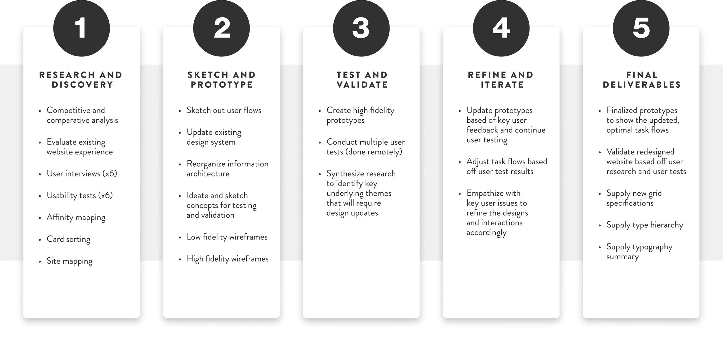
PROCESS AND STRATEGY
HEURISTIC EVALUATION
The website I selected to redesign was Echelon Cycles NYC, a full-service bike shop located in the Chelsea neighborhood of Manhattan. After conducting a heuristic evaluation on the company’s current site (as of 2/7/2025), numerous flaws in its UI design were discovered.


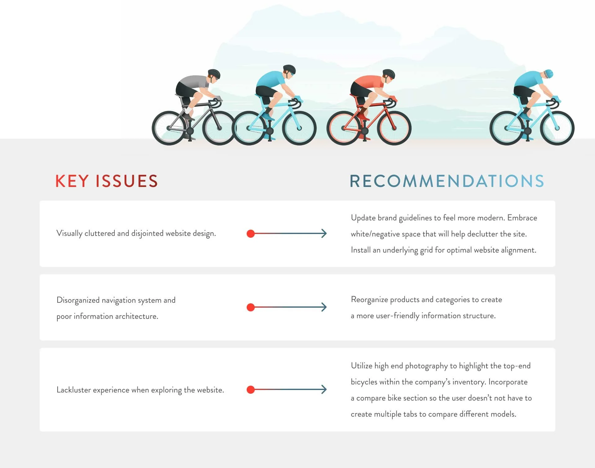
SUMMARY of FINDINGS
The homepage suffers from visual overcrowding, making it difficult for users to focus on key elements.
The logo exhibits design flaws with inconsistent stroke weights, compromising brand identity.
The color palette appears dated and fails to reflect contemporary design trends.
The layout lacks a coherent grid system, resulting in disorganized content placement.
Text alignment is inconsistent across the site, with an awkward mixture of left, center, and right-aligned content.
Images are improperly cropped, cutting off important visual elements or creating awkward compositions. Visual assets vary in resolution and quality, detracting from the site's professional appearance.
The site structure and navigation lack intuitive organization, making it challenging for users to find information.
Text overlaid on images lacks sufficient contrast, making content difficult to read.
Typography varies without clear hierarchy or purpose, creating a disjointed user experience.
Bike product images appear isolated against white backgrounds, lacking context and integration with the page design. The small thumbnails prevent customers from appreciating important visual details and features.

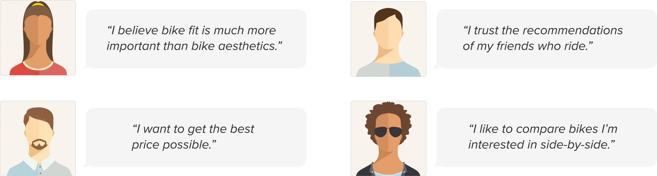
USER INTERVIEWS
There were 6 participants who served as target users for this project. The riding levels among these individuals ranged from novice (rides 0-2 times a year in warm weather conditions) to experienced (rides 3+ times a week in warm weather conditions). A semi-structured interview was then conducted to discover how these target users
form their habits, motivations and challenges in regards to cycling as a hobby.
Each interviewee was also asked to do a usability test on the current website. Their task was to visit the site, find a bike they liked, then proceed to purchase it.
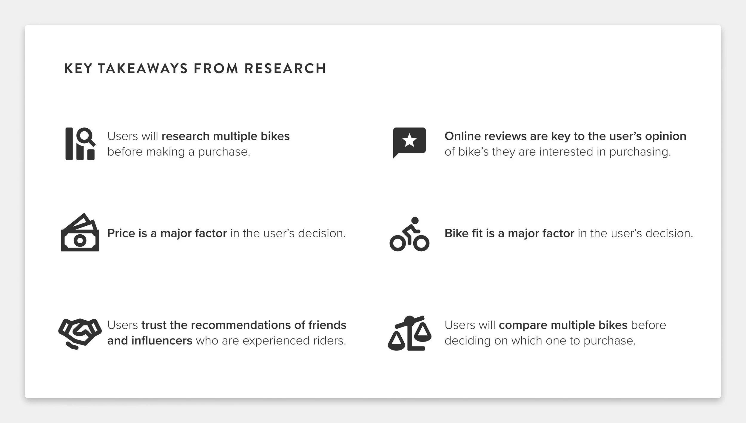
AFFINITY MAPPING
After completing all video sessions and synthesizing the information, I created an affinity map that revealed four underlying themes from target users' responses. User feedback also highlighted six key priorities influencing purchase decisions.
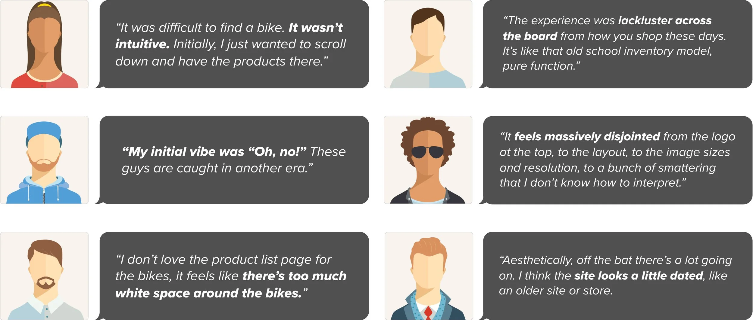
USABILITY TEST takeaways
After conducting usability tests with the existing Echelon Cycles website, users expressed multiple frustrations when trying to complete the assigned task.
PERSONA
From these insights, a faux persona was crafted to help shareholders understand and empathize with potential users. This persona served as a reference point for design decisions, ensuring the redesigned product catered to user needs and expectations.

PROBLEM STATEMENT
Lawrence needs a better way to search for a new road bike because it has been 10+ years since he last bought one and he is unsure which bike model fits his riding style. He needs to compare multiple road bikes across numerous categories to make sure this expensive purchase is worthwhile so he can make cycling his primary form of exercise.
Competitive and comparative analysis
The following websites were selected and analyzed to discover more about the current UI design standards of e-commerce websites: Competitive Cyclist, Specialized and Backcountry. These three sites also served as key inspiration for my redesign concepts and played a pivotal role in determining which design solutions were pursued.


BRAND REDESIGN
The initial focus of my redesign was addressing the brand identity. The current Echelon Cycles New York City logo features an orange and beige color palette that appears outdated. The italicized slab serif font lacks a modern or innovative feel, and the various stroke weights with inconsistent thicknesses further detract from its contemporary appeal.
After numerous iterations, I developed a refined logo concept that eliminates the orange coloration in favor of a cleaner aesthetic. The redesign incorporates a sans serif typeface that conveys a more modern, up-to-date impression that better aligns with cycling brand aesthetics. This refreshed logo serves as a crucial first impression when customers visit their website.


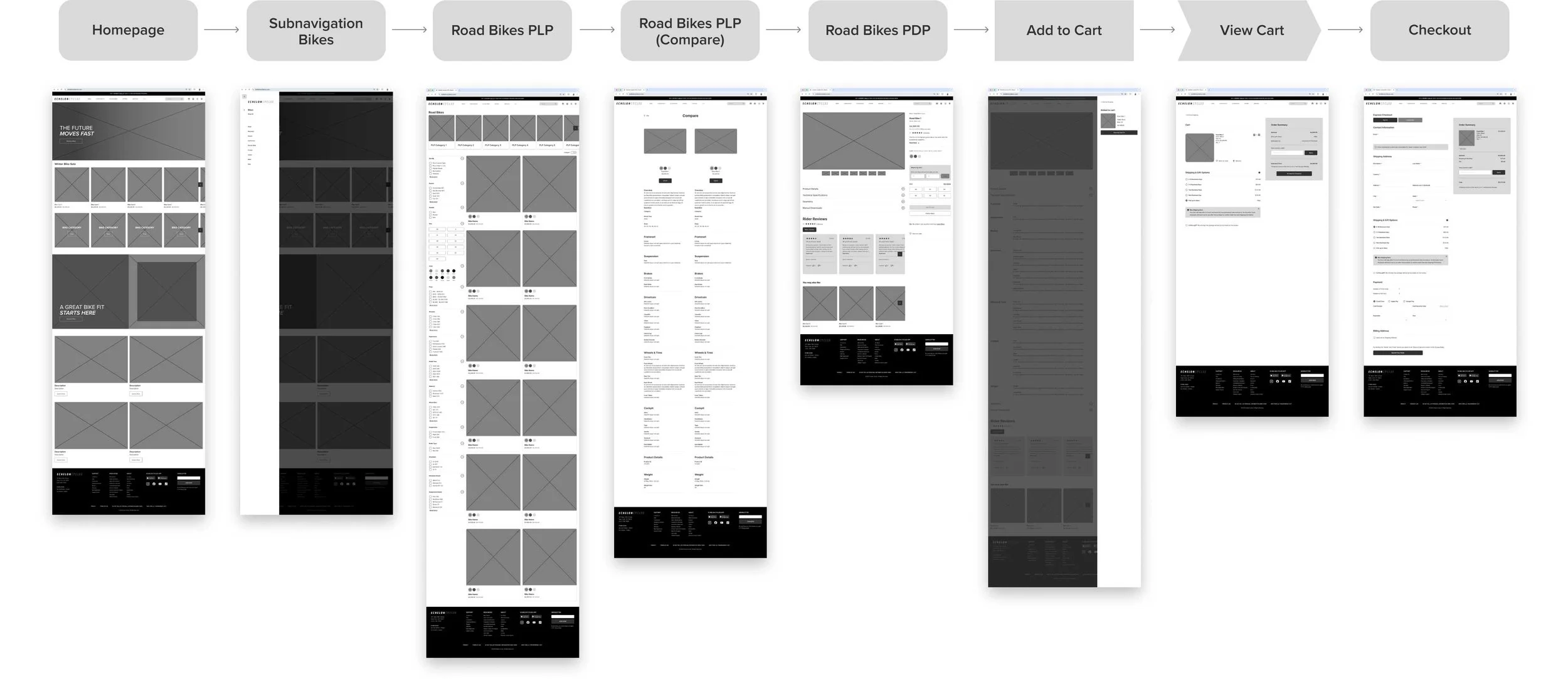
TASK FLOW, WIREFLOW and low fidelity wireframes
Before starting the ideation phase, I created a clear task flow:
Visit the Echelon Cycles website, compare two road bikes of your choice, select your preferred option, review your cart, and complete the purchase.
This task flow provided the foundation for developing the necessary low-fidelity wireframes for the redesign. After several rounds of ideation, I developed a wire flow to illustrate the user journey between pages when completing this core task.

PROTOTYPE

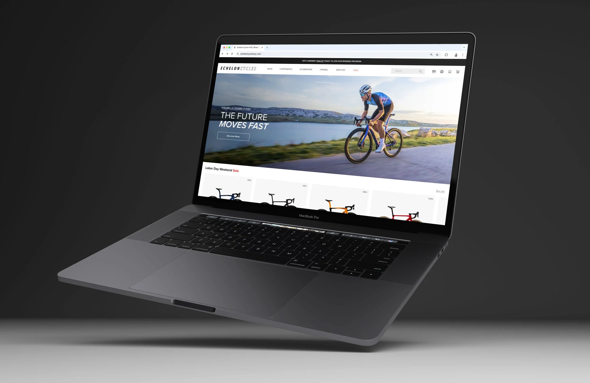
HOMEPAGE
My primary focus for the high-fidelity wireframe stage was establishing a consistent grid system to reduce visual clutter. By embracing negative space throughout the layout, typography and imagery have more room to breathe, enhancing legibility and projecting greater legitimacy for the website.
On the landing page, the copy has been refined for conciseness and impact. The hero section features a perfectly framed cyclist with bike, creating an engaging lifestyle visual that welcomes visitors.
Below this, two sliding carousels appear: the top showcasing sale items or featured bikes from inventory, while the second highlights bike categories with professional photography specific to each type.
Further down, clean, visually appealing images accompany links to Echelon Cycle's services and apparel collections, maintaining the site's polished aesthetic throughout. The footer has also been reformatted and reorganized for better navigation.


product list page (PLP)
Once we click on Road bikes, it takes us to the product listing page. Here we have the bikes laid out in rows that feature two bikes each. This is intentional and meant to allow the user to actually see the bike and take in all of the beautiful frames, colors and geometries of each model. There’s also a filter bar on the left side that allows you to narrow down the search for bikes you’re interested in whether that’s by brand, color, price, etc.

PLP Page + Compare bikes OPTION
To address the user’s need to compare multiple bikes when searching, a compare bikes feature has been included and starts with a toggle in the top left corner. When activated, the toggle turns green and a prompt appears at the bottom of the screen asking you to select two bikes to compare. The product cards change slightly, adding green checkboxes in the upper right corners for selecting the bikes you wish to compare.


BIKE COMPARISON PAGE
After selecting two bikes to compare, users are taken to a comparison page displaying both bikes side by side with aligned product details and specifications. This parallel presentation makes it easy to evaluate differences between the bikes. When ready, users can select their preferred bike to proceed with purchase, or they can revert back to the PLP page and select two more bikes to compare.

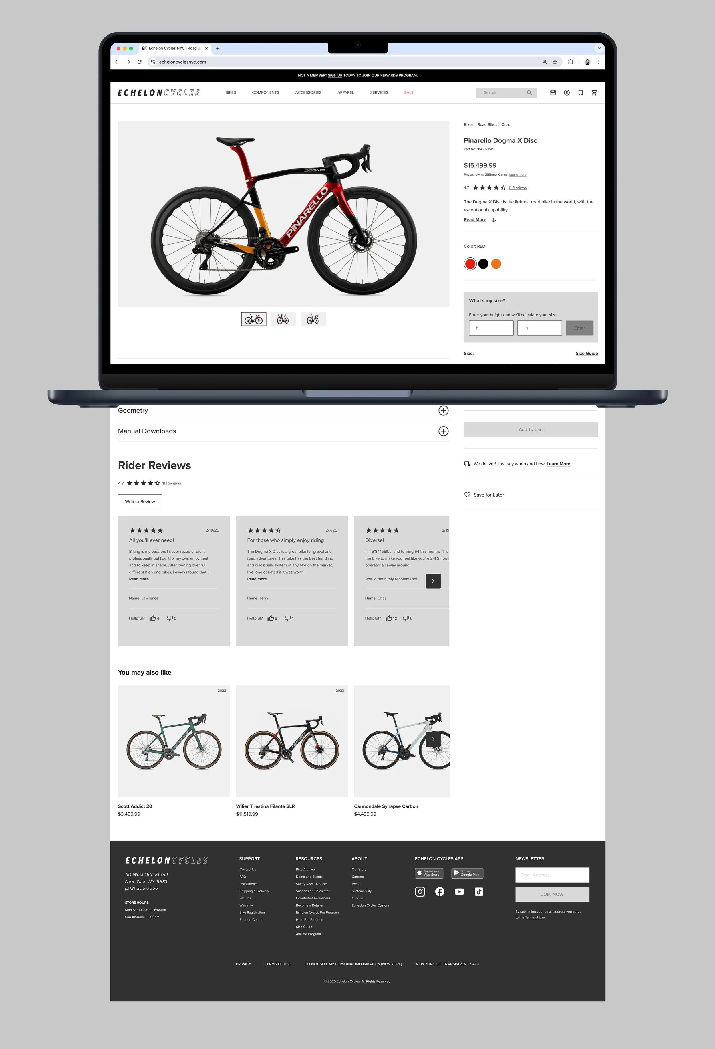
PRODUCT DETAIL PAGE (PDP)
After selecting a bike, users are directed to the Product Detail Page where they can examine all specific details including size, color, intended usage, testimonials, and user reviews. The PDP also suggests additional bike options based on previous search history. Large, high-quality images display the bike from multiple angles for thorough exploration.
Cart, checkout and order confirmation
After selecting your desired bike, it's added to your cart for review. When ready to purchase, proceed to checkout where you'll enter your personal and payment details. Once you confirm payment, you'll receive an order confirmation with all important information about your purchase.


REFLECTION and conclusion
This project highlighted the value of analyzing existing websites to understand effective UI design principles. By examining successful e-commerce platforms, I gained crucial insights into modern aesthetic standards. I discovered how thoughtful implementation of color schemes, typography choices, and layout structures directly impacts user experience.
When a site's visual elements appear disorganized or unprofessional, users quickly lose trust and abandon the platform. This research reinforced that visual coherence isn't merely decorative—it's fundamental to establishing legitimacy and maintaining user engagement in the e-commerce space.
Figma file can be found here.